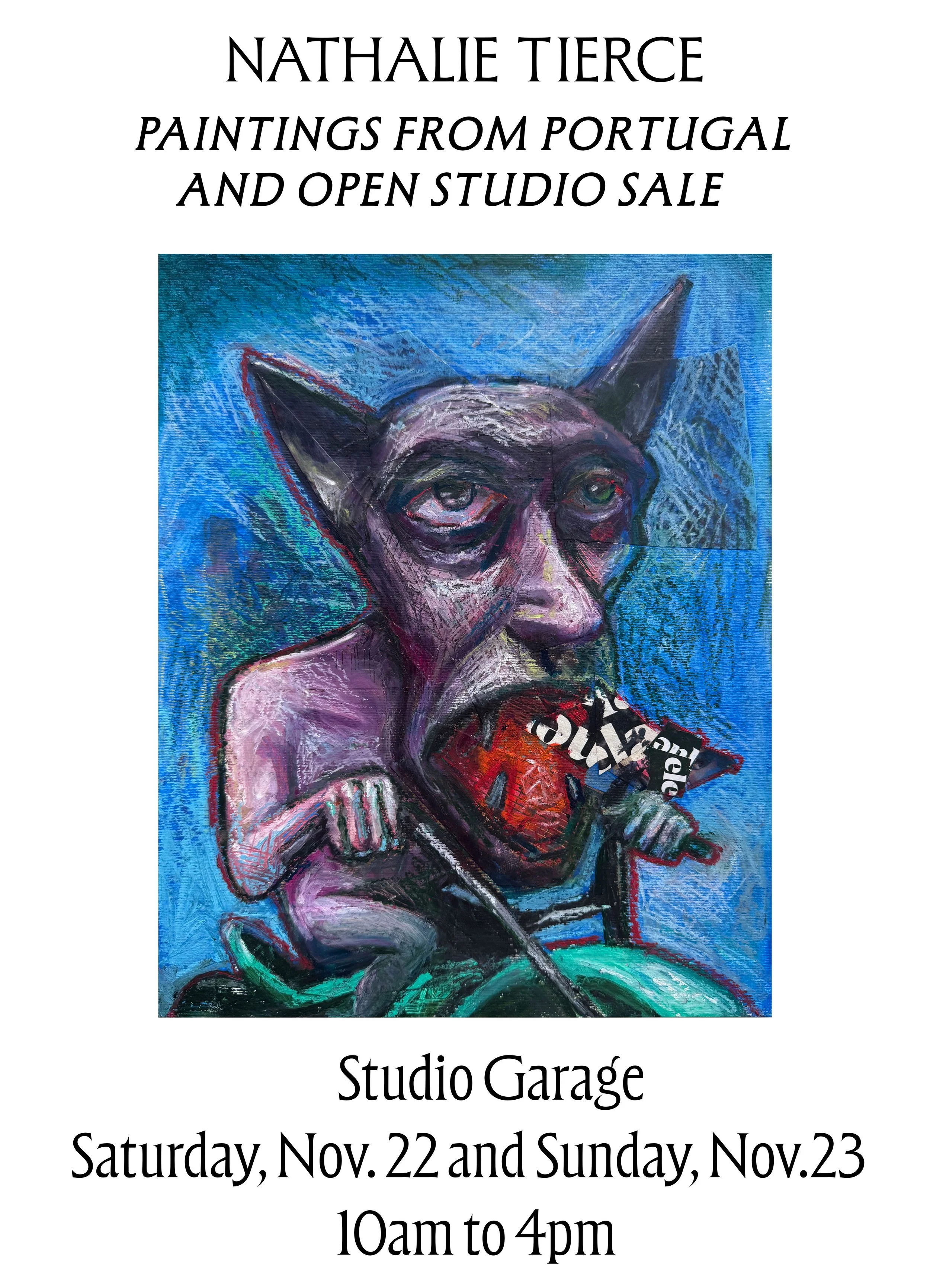
Paintings from Portugal - Open Studio
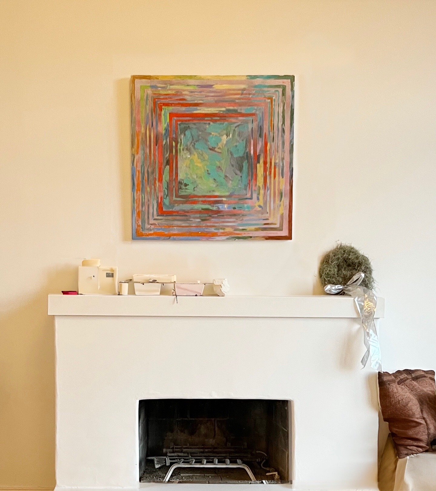
Open Studio Sale — THIS WEEKEND
My studio is finally set up and ready for visitors, and I’d love to share what I’ve been making. This summer’s Portugal residency gave me a whole new vocabulary of color and character, and since returning I’ve been developing that work alongside pieces pulled from the deeper corners of my racks and archives.
Everything in the studio this weekend is discounted for a pre–Black Friday sale, including framed works and originals from Portugal.
If you’ve never been to my studio before, email me @ntierce1@gmail.com and I’ll send you the address.
Saturday + Sunday
Nov. 22–23
10am–4pm
Come by, say hello, and see the new paintings in person. I’d love to share this work with you
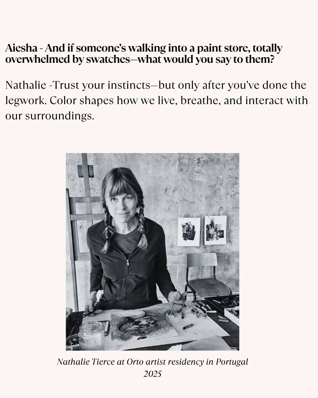
The Science of Color: A Conversation with Nathalie Tierce
Many of you know me through my paintings and allegorical work, but what you may not know is that I’m also an architectural color consultant. Just as I use color on canvas to shape story and emotion, I help homeowners and real estate professionals use color to transform spaces. You can see more about that side of me here: www.customcolorandart.com In this blog, I’m excited to share that side of my practice and to introduce you to the talented realtor Aiesha Bailey, with whom I’ve had the pleasure of collaborating on several beautiful properties.
I’m thrilled to use this blog as a space to bridge those worlds and share more about how color lives at the heart of all that I do.
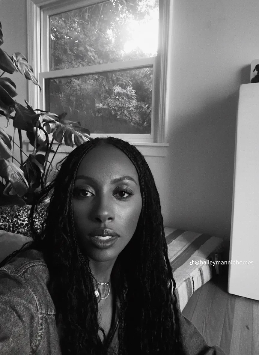
I want to extend a warm thank you to Aiesha Bailey, she a knowledgeable and insightful professional with Nourmand & Associates. I learn something new every time we work together. She generously wrote and shared this article recommending my work to her clients, and I’m honored to share it here with you.
Aiesha: Nathalie, every time we talk, I walk away with new insight about color. But for those unfamiliar with your background, how did you find your way into color consulting?
Nathalie: I began studying art seriously at 14, attending the High School of Art and Design in New York City. At the time, I thought I’d become a commercial illustrator, but while I was there, I interned at an off-Broadway theater, which opened my eyes to set design and props. That experience led me to Pratt Institute for my BFA, and later to the Beaux-Arts in Paris for a study abroad program.
After Disney, I spent years as a scenic artist in London’s film industry. But it was 10 to 12-hour days, always giving 100 percent. When I moved to Los Angeles, it was the same.
Aiesha: So where did the color consulting come in?
Nathalie: It grew organically…

Aiesha - That sounds like it was a rich and varied journey. Was there a specific moment when you knew it was time to pivot?
Nathalie - When my son Joshua was born in 2007, my world shifted, and I reimagined my path. I began leading large-scale mural and ceiling projects in private homes, often collaborating with fellow artists. It was an incredible phase in my artistic career.
During those projects, clients frequently asked for color guidance: interiors, exteriors, roof tiles, landscaping, even pool finishes. I loved it. With my eye, training and communication skills, I was able to help. In 2008, I launched Custom Color and Art, focusing exclusively on color consultation.
Aiesha - I love that you found your niche in something that had been quietly calling you all along. What kinds of projects do you typically take on today?
Nathalie - I work primarily with private homeowners, with select commercial projects. Clients often bring me in when they feel overwhelmed. One of the greatest values I provide is helping them avoid costly mistakes. A color that looks perfect on a neighbor’s house may clash on yours - light, landscaping, and even the texture of your stucco all change how it reads. My role is to create harmony between architecture, environment, and personal taste.

Aiesha- I imagine you’ve had your share of “rescue” calls when someone skips the consultation and then needs help mid-crisis?
Nathalie- Yes, especially with exteriors. By the time I get the call, paint might already be going up - and it’s wrong. Often, it’s because they didn’t sample properly or used a board indoors and assumed it would look the same outside. Lighting and surface textures change everything. It’s stressful for them and me, because I want to help - but I’m often booked well in advance.
Aiesha - So what’s the right way to sample paint? What do people commonly overlook?
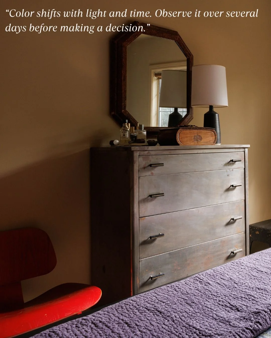
Nathalie - Sample it the way it would actually be applied - two or three full coats, using the same tool your painter will use roller, brush, or spray. If it’s brushed on trim, brush the sample. If it’s rolled on stucco, roll it on stucco. Size matters, too. I recommend 12 by 24-inch samples for exteriors, placed in different light conditions throughout the day. And most importantly - be patient. Color shifts with light and time. Observe it over several days before making a decision.
Aiesha - Let’s talk about trends. With social media constantly showing perfectly styled spaces, how do you help clients stay grounded in what actually works for their home?
Nathalie - Oh, Instagram and Pinterest have a lot to answer for! [Laughs] People see a perfectly lit, filtered room and think, “I want that.” But that same color might fall flat in their home. The “gray craze” is a good example - people assume gray is safe and chic, but without variation or warmth, it can feel cold and lifeless.
What I do is look for themes in what they are drawn to. If they bring me inspiration photos, I help identify common threads. Then I reinterpret those elements to suit their environment and lifestyle.
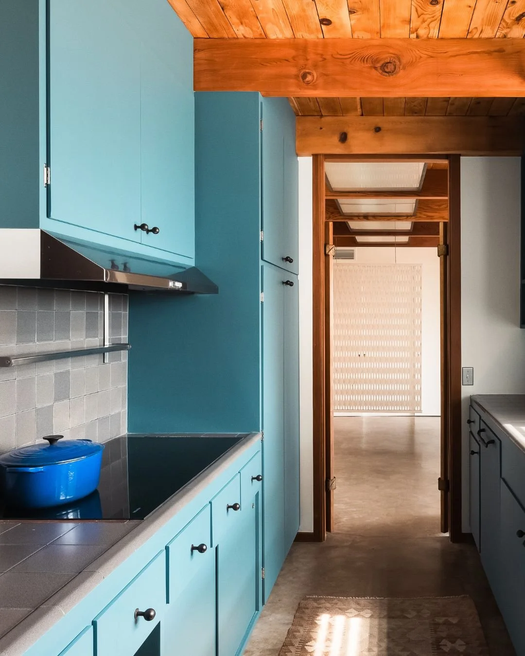
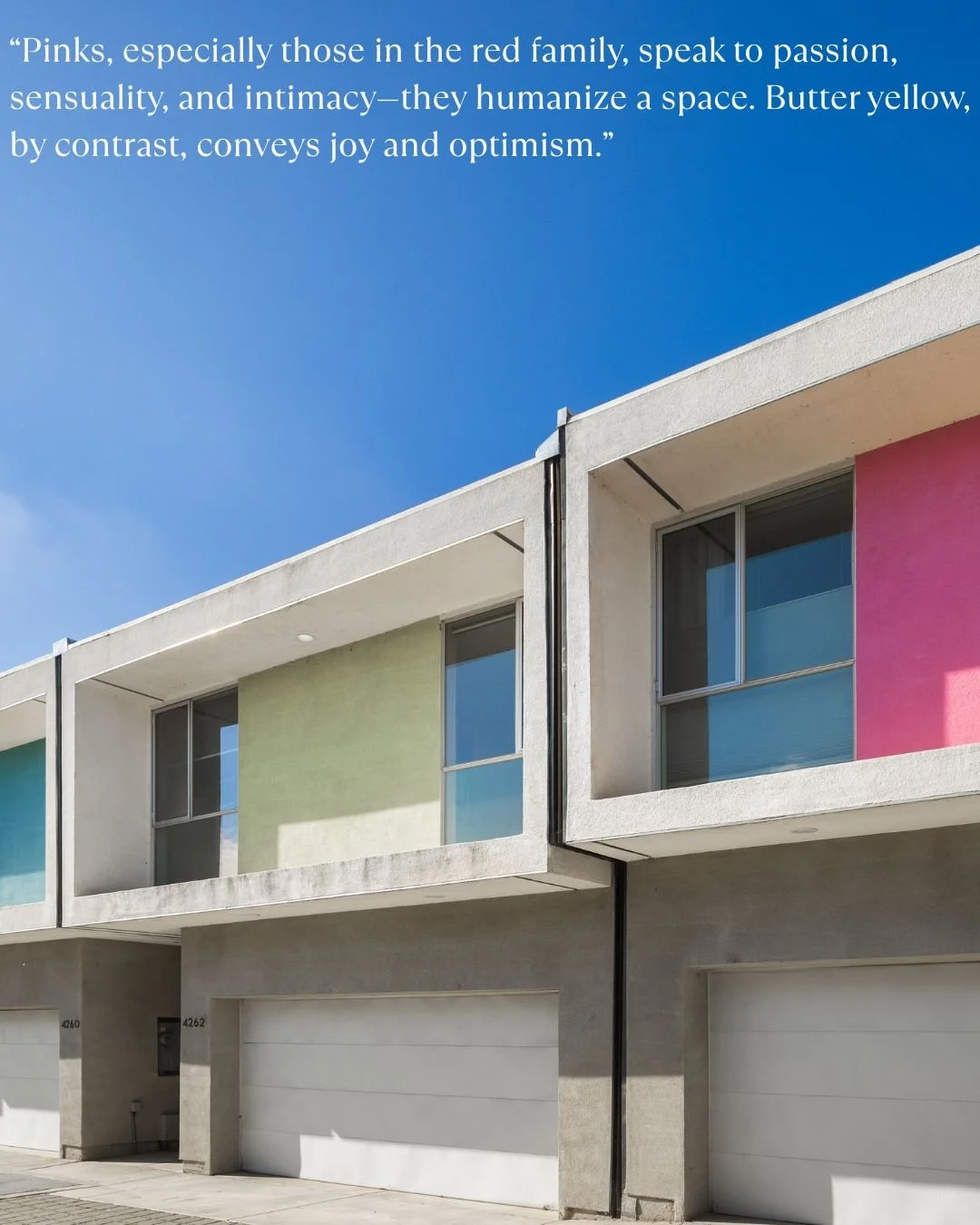
Aiesha - Let’s talk about some of the trends I’ve noticed recently- like millennial pink and butter yellow? Why do you think these colors have become so beloved?
Nathalie - Starting around 2008, gray and other muted neutrals dominated interior design, reflecting the caution and uncertainty of the time. People craved stability, and gray felt like a safe, clean choice. By 2019, though, fatigue had set in, and the pandemic only accelerated the shift. We began craving warmth, personality, and emotional connection in our spaces.
That is where colors like millennial pink and butter yellow entered the scene. Pinks, especially those in the red family, speak to passion, sensuality, and intimacy - they humanize a space. Butter yellow, by contrast, conveys joy and optimism. Psychologically, it sparks energy and forward motion, unlike the introspective nature of blues and greens.
These colors are more than aesthetic trends. They are emotional responses, reflecting a collective desire for soul and expression in our surroundings. Color is back as a language of feeling, and that return inspires me deeply.

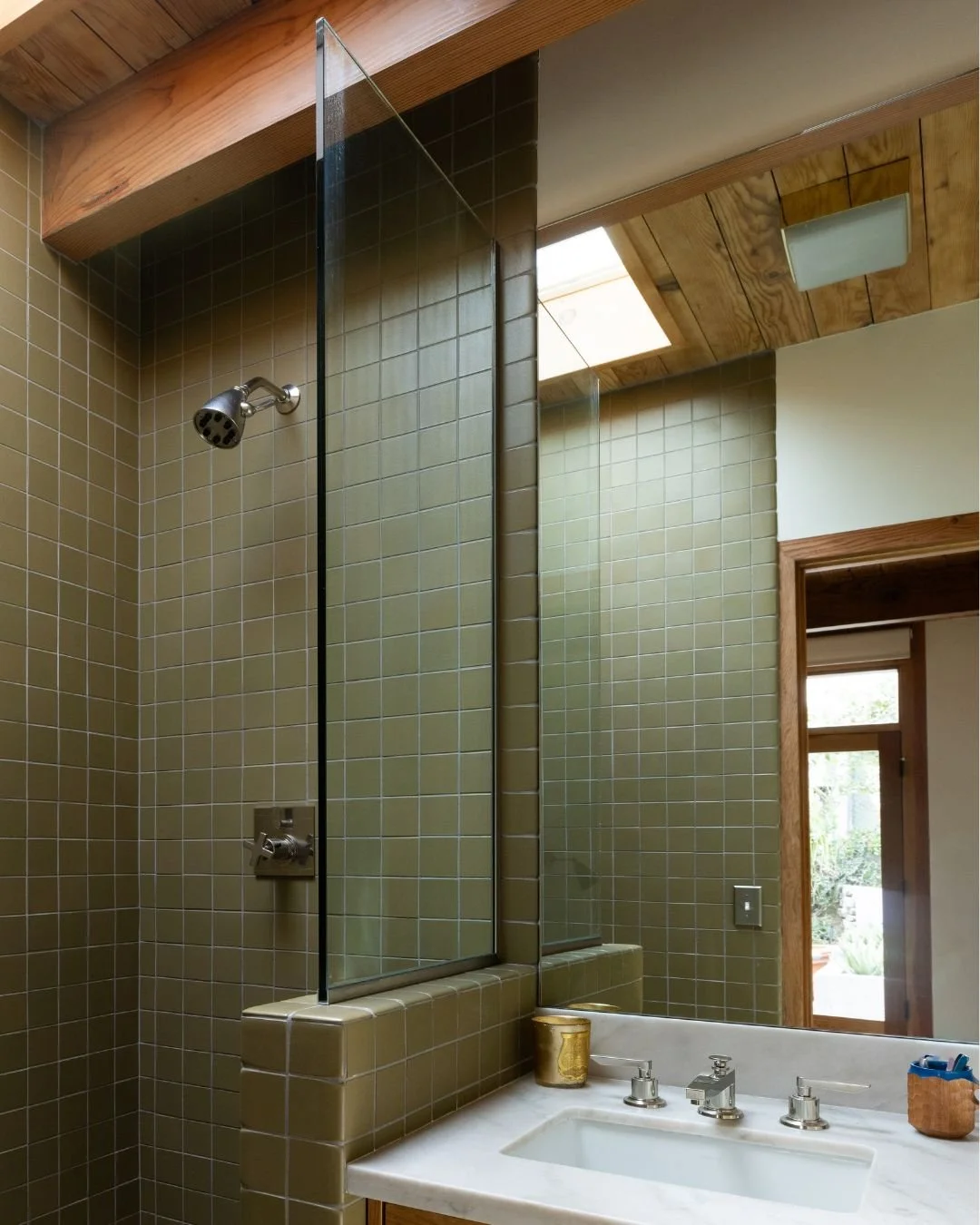
Nathalie - Color multiples in impact as it scales. What seems soft on a swatch can feel intense when it covers an entire room, especially in color-drenching where walls, trim, and even ceilings share the same or harmonized hues. Context is everything.
Begin by observing your space. How much natural light does it get? North-facing rooms cool colors, while south-facing rooms warm them. Artificial lighting also shifts perception depending on whether it leans warm, cool, or neutral.
If a color you love feels too bold, do not discard it, refine it.
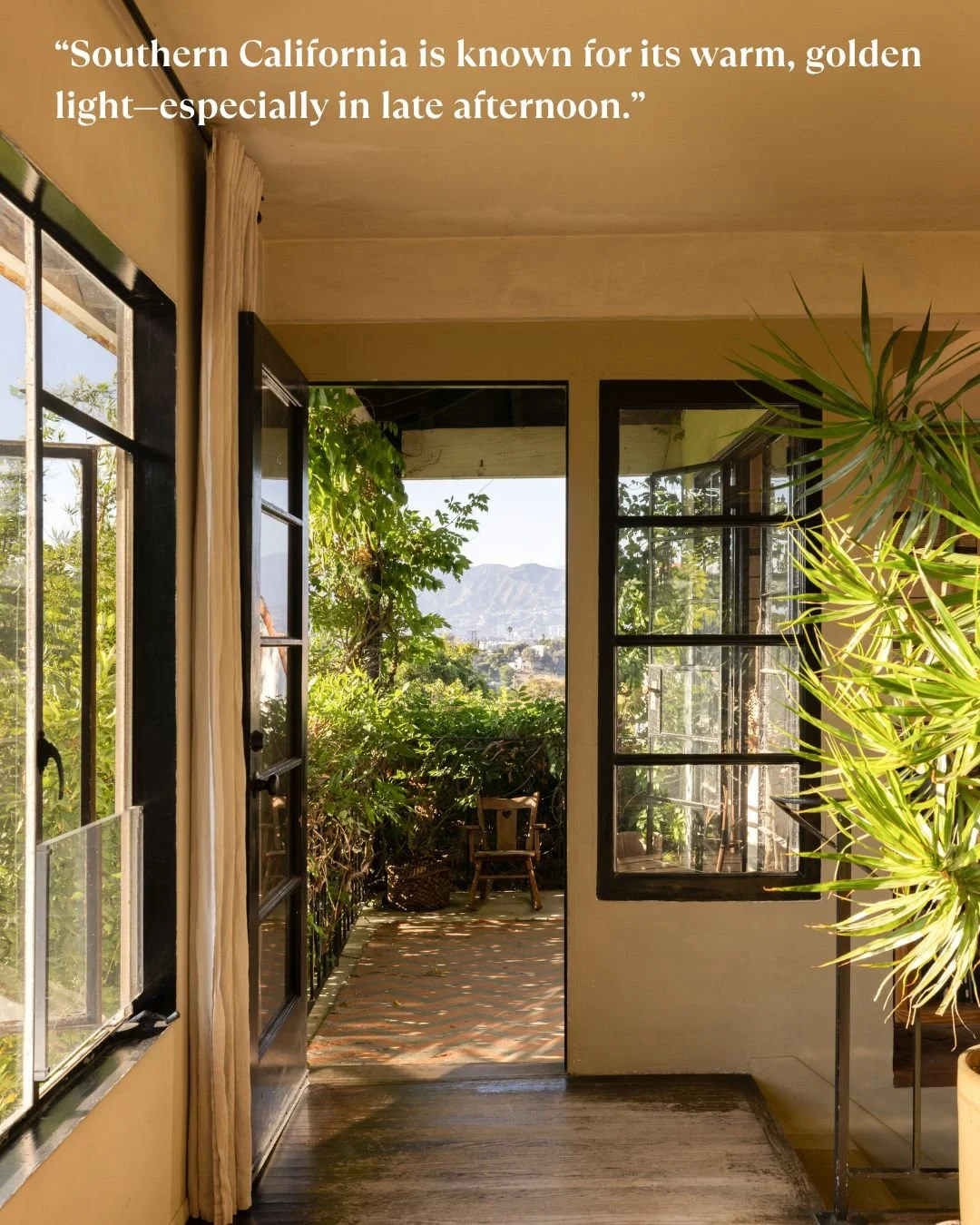
Aiesha - You’re originally from New York and have lived in France and London. How does light and architecture affect color choices in Los Angeles compared to those places?
Nathalie - Geography plays a major role in how we experience color, and light quality is one of the most critical factors I consider when building a palette.
Southern California is known for its warm, golden light - especially in late afternoon. That kind of sunlight can make colors appear more saturated, sometimes even exaggerated. So, when I use bold hues here, the concern isn’t that they’ll feel flat - it’s that they might overwhelm or cause “color bounce,” where walls reflect more color into the space than expected.
In contrast, cities like New York, Paris, or London tend to have cooler, diffused light due to weather and seasonal grayness. In those environments, colors read more subdued, even moody. Richer tones feel cozy rather than loud. The concern there is usually about making sure a space doesn’t feel too dim or cold.
What feels romantic in a London flat might feel garish in a California bungalow, simply because of the surrounding light and architecture. The same red may feel warm and elegant in one setting - and jarring in another.
Aiesha - For someone just beginning a renovation or new build, what’s a smart first step when it comes to color?
Nathalie - Start with a feeling. Ask: How do I want this space to make me feel? Calm and serene? Bright and energized? Cozy and nostalgic? Once you have that, start collecting references - photos, textiles film stills. I often suggest clients think about movie interiors they love. Take Nancy Meyers’ films- those spaces feel effortlessly homey, with soft tones and natural light. They tell a story of comfort.
In set design, we’ve built entire worlds around emotional tone. When I worked on Interview with the Vampire, the palette was all deep merlots, crimsons and rusts - colors that supported the story. It’s no different with homes. Color sets the emotional tone. Used with intention, it creates atmosphere and cohesion. That’s what I help clients discover.
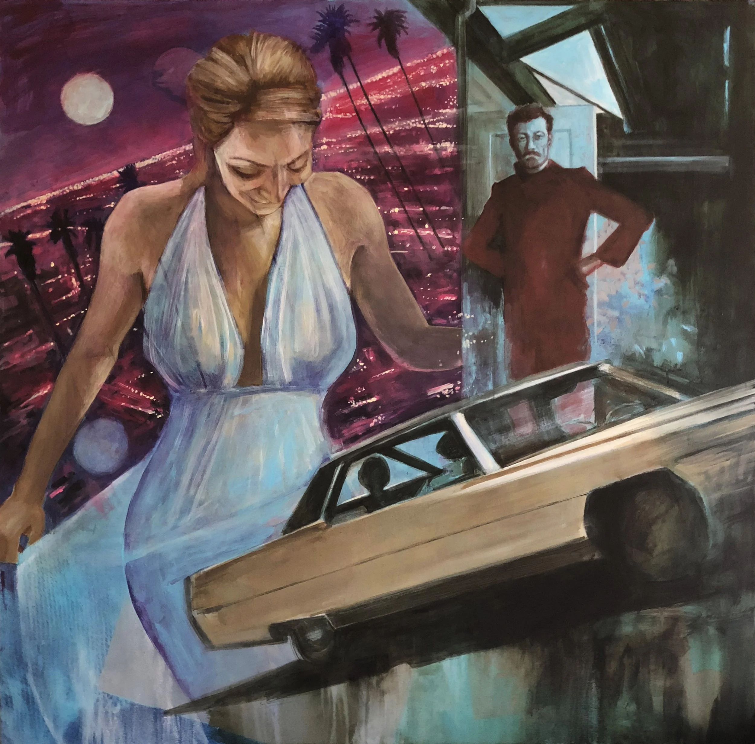
Three Scenes After Midnight at the Santa Monica Art Museum
It has been a wonderful experience seeing my painting, Three Scenes After Midnight, installed as part of the Santa Monica Art Museum’s exhibit “Local,” a dynamic survey of artists rooted in Los Angeles.
My piece engages with the city’s mythic underbelly, drawing on a Raymond Chandler–like lens of noir mystery and drama. Los Angeles, long bathed in Hollywood’s golden glow, is also a city of contradictions—where glamour and danger share the same streetlight. Three Scenes After Midnight presents three fractured vignettes in dialogue: a woman bathed in cinematic light, a lone figure watching from the shadows, and a car poised between descent and flight. The backdrop of neon-pink city lights and looming palms gives the sense of a dream unraveling—or perhaps the moment before a secret is revealed.
Each scene is both intimate and theatrical, hinting at stories withheld, much like the city itself. Figures glance downward or sideways, as if caught in a frame of unfinished film. The car becomes a vehicle of suspense, suspended in time, its passengers anonymous silhouettes. These disparate moments converge in a collage of mood and atmosphere, a meditation on how Los Angeles reveals its truths obliquely, through fragments, shadows, and suggestion.
The show runs through the end of the month, with the possibility of an extension.
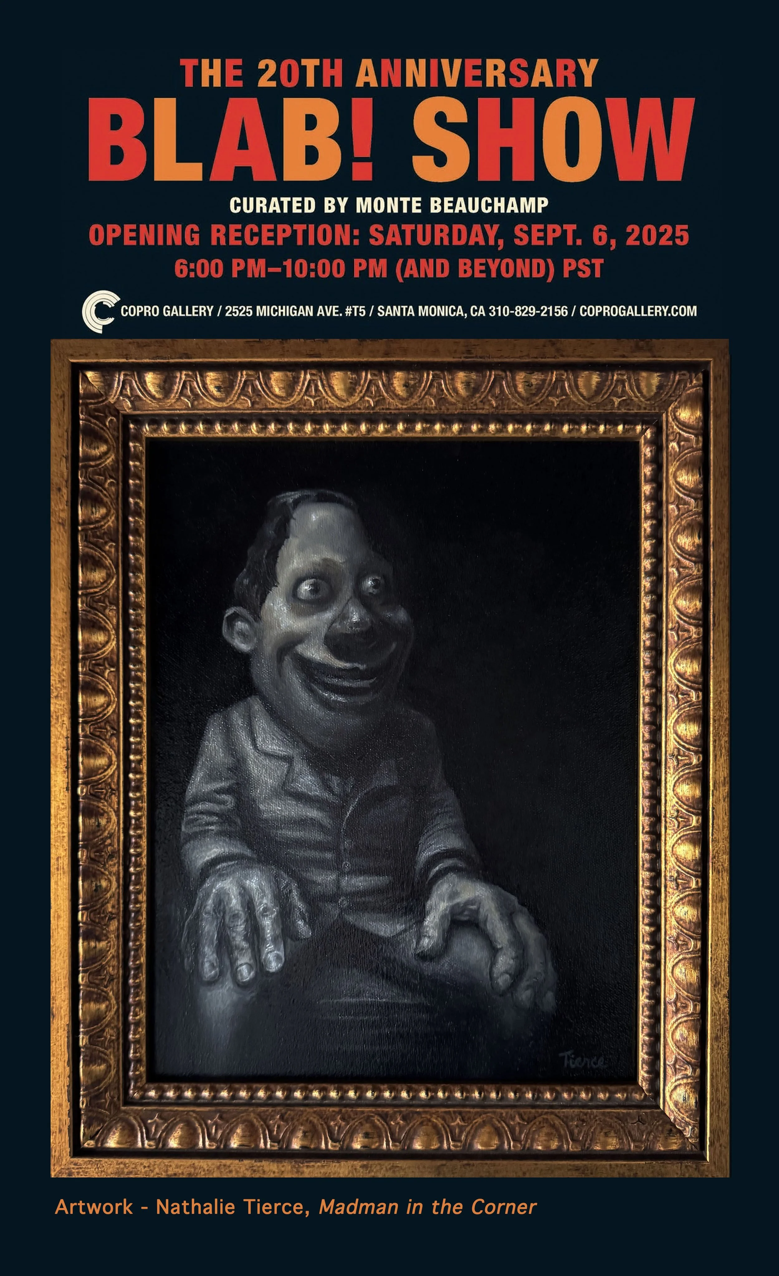
BLAB! Show at Copro Gallery, Santa Monica
The 20th Anniversary BLAB! Show at Copro Gallery
Santa Monica’s Copro Gallery is celebrating a milestone: 20 years of THE BLAB! SHOW, the acclaimed pop-surrealist exhibition curated by Monte Beauchamp. The anniversary show opened September 6, 2025, and runs through September 27 at Bergamot Station, drawing together more than 70 artists who embody the show’s signature mix of wonder, dread, and wit.
From the beginning, BLAB! has been a space where artists mine the visual language of comics, pulp, and surrealism to create work that feels like both fairy tale and fever dream. Over the years, critics have praised it as a “carnival of imagination” and “an act of creative freedom” that continues to bring together some of the most innovative voices in lowbrow and pop-surrealist art.
The roster for this year’s show is as impressive as ever—featuring Chris Towle, Jesús Aguado, Anthony Ausgang, Glenn Barr, Victor Castillo, Camille Rose Garcia, Kris Kuksi, Travis Louie, Chris Mars, Scott Musgrove, Nouar, Greg “Craola” Simkins, Joe Sorren, Casey Weldon, and many others. Each artist brings their own vision of the absurd, the fantastic, and the deeply human.
My Contribution: Madman in the Corner
For this year’s BLAB!, I am showing Madman in the Corner. The piece explores the psychological charge of edges and margins—the places in a room where attention rarely lingers, yet where unease gathers. Corners, by their nature, are spaces of containment. They hold what is cast off or hidden until it begins to take form on its own.
Why BLAB! Still Resonates
At 20 years, BLAB! is more than an art show—it is an ecosystem. It thrives on the tension between the playful and the grotesque, the decorative and the disruptive. Works here are beautiful, but never passive. They linger with viewers because they engage the unconscious: archetypes of clowns, monsters, doubles, and dreamscapes that echo something inside us.
That mix—spectacle cut with psychological truth—is what makes BLAB! vital, even now. It remains a place where audiences can laugh, shiver, and recognize themselves in the same breath.
Visit the Show
Dates: September 6–27, 2025
Opening Reception: September 6, 6–10 p.m. (and beyond)
Location: Copro Gallery, Bergamot Station, 2525 Michigan Ave. #T5, Santa Monica, CA
Gallery Hours: Friday 11–7, Saturday 12–5, Sunday 11–6
Admission is free, and if you attend, I recommend letting the show unfold slowly. Start with the spectacle, but linger in the quieter corners—those are often where the most interesting conversations begin.
Reflections from My Residency in Portugal
I’ve returned from three weeks at the Orto artist residency in Portugal. The days were steady and productive. I worked in a stone studio, sometimes with a goose keeping me company, and built a new body of work that pushed my ideas forward.
Read MoreMy Mixed Media Piece at the Santa Monica Art Museum
I still catch my breath recalling the moment I learned that my mixed-media piece, Ziggy and my Favorite Extraterrestrials, had been accepted into A Day with David Bowie—an exhibition now extended through September 28 at the Santa Monica Art Museum. It’s an honor that feels like a shimmering echo of the very spirit that inspired the work.
At the heart of the exhibition is a serene, almost meditative showcase of rarely seen black-and-white photographs by Austrian photographer Christine de Grancy, capturing David Bowie’s 1994 visit to the Art Brut Center in Gugging. These images are not of the glam-era Bowie or the theatrical alien rock star. They show something quieter and more intimate: Bowie seated on a lawn, cigarette in hand, enveloped in dusk, deeply present and reflective. This is the Bowie who leans in close, who listens, who allows himself to be moved by the work of others. That quiet openness is what makes the setting so soulful—and what makes this exhibition feel so personal.
My piece, Ziggy and my Favorite Extraterrestrials, riffs on the mythology of Bowie’s iconic character but pushes beyond the Ziggy archetype into a kind of cosmic language—part mythology, part inner theater. It’s about transformation, reinvention, and letting the strange and beautiful lead the way. To have that work hanging within an exhibit that so thoughtfully honors Bowie’s own openness to the outsider, the uncanny, and the deeply human is more than just a professional milestone—it’s a kind of artistic alignment.
Originally scheduled for a shorter run, the show has now been extended—twice—into late September. I’m beyond grateful that my work gets to be part of this moment, part of this conversation, and part of the quiet magic this show seems to offer.

When you visit, you’ll encounter a Bowie that feels deeply human—no glitter, no stadiums—just a man in black and white, captured by a sensitive and empathetic lens. The layout of the space breathes, allowing the photographs—and any work displayed alongside them—to land with clarity. There’s also a beautifully curated companion exhibition, Spectacle, featuring 60 large-scale photographs from National Geographic, running concurrently and also extended through September. It’s a show that invites contemplation, and also rewards curiosity.
The Santa Monica Art Museum is open Wednesday through Friday, 12–8 p.m., and weekends from 10 a.m.–8 p.m. It’s wheelchair accessible, and they also offer private visits, making it an inviting experience for all kinds of visitors.
I hope you’ll make time to see it. And if you do stop by, I hope you find a little piece of stardust—Bowie’s or mine—that stays with you.


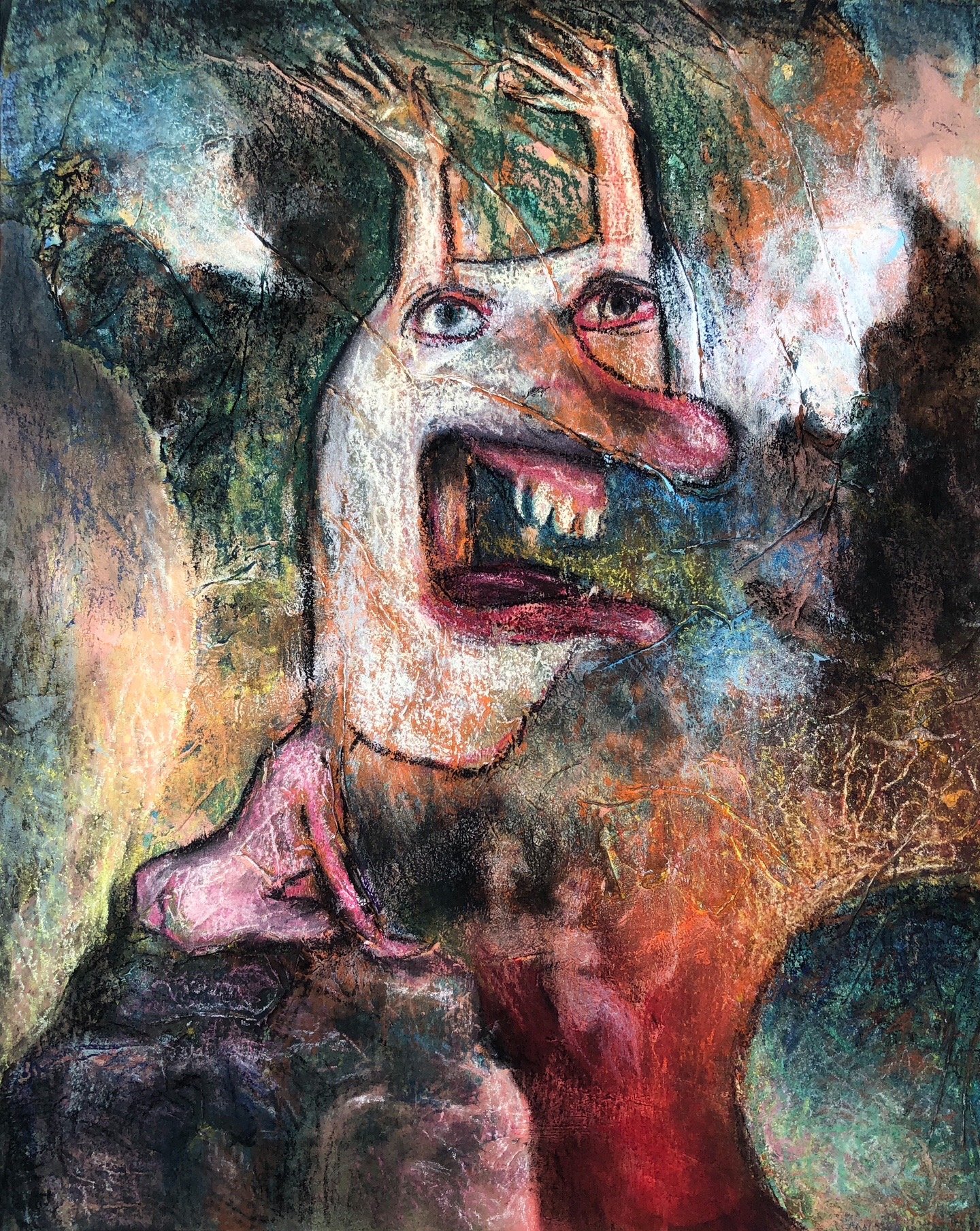
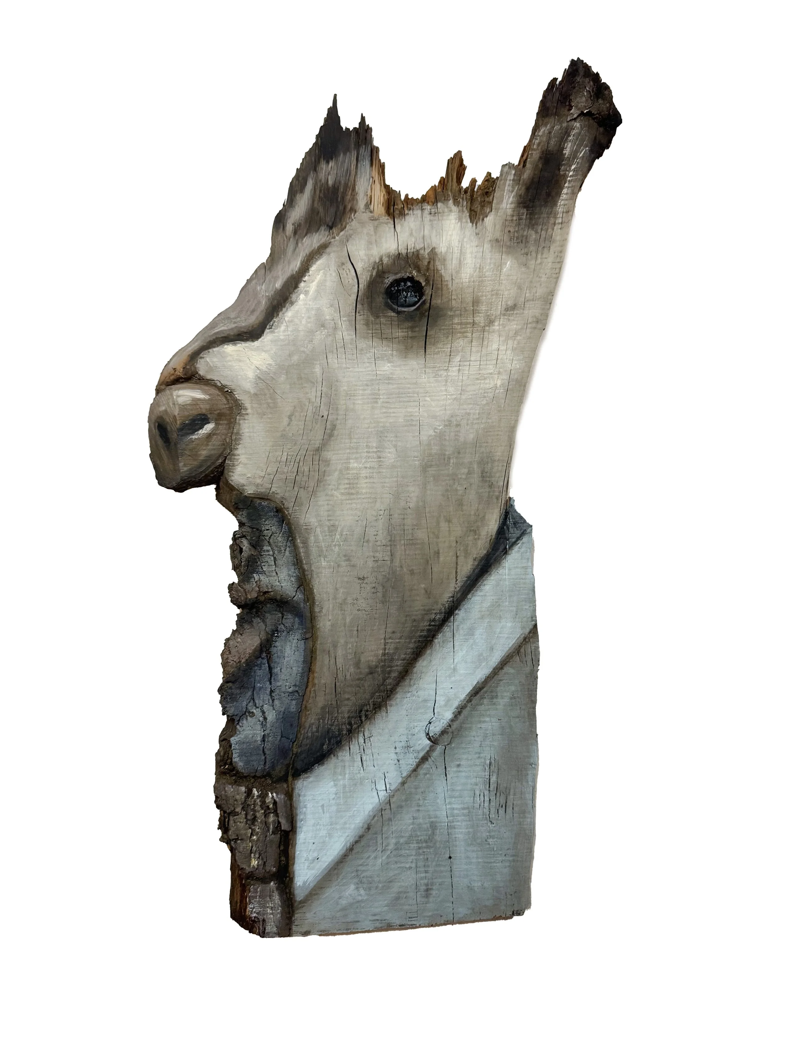
The Dance Between Creation and Destruction
In this piece, a skeletal Grim Reaper reaches for an eager, wide-eyed rabbit. It’s an absurd but familiar scene: death inviting joy into its arms. And yet, isn’t this the exact tension I feel when deciding whether to keep painting or walk away?
Rabbits, for me, symbolize play, joy, and fertility—not just in the literal sense, but in the realm of ideas. They represent momentum, spontaneity, the creative spark that makes making art fun in the first place. The Grim Reaper? He’s the force of overthinking, perfectionism, the temptation to keep refining until the life of the piece is drained away.
It’s an eerie realization that my artistic process mirrors the very scene I painted.
I’ve been noodling this painting, tweaking details, questioning every highlight, every shadow, debating whether to push it further or let it breathe. It’s that fine line between playing and overworking—a line every artist knows too well.
Maybe that’s why the rabbit looks at me like that. It knows I’m debating its fate.

Lizard Lady, Oil, Oil pastels on canvas, 30” x 60”. Nathalie Tierce
Finding Home After Loss Through Art
Art has a way of anchoring us to a place, a time, a feeling.
Recently, collectors of mine lost their beautiful home in Altadena, along with seven of my artworks, in the Eaton Fire. Thankfully, they and their pets escaped unharmed—but the loss of their space, their memories, and the art they had carefully chosen over time was heartbreaking.
When they reached out, they told me something that truly moved me: losing my pieces was one of the things that saddened them most. Art had become part of their sense of home.

Home Alone, Oil pastel on collaged drawing pieces, 17” x 20”. Nathalie Tierce

Gatekeeper, Oil pastel on paper, 13” x 16”. Nathalie Tierce
To honor their journey, I gifted them “Hero” and “Demon Dog”—two works they had admired.

Hero, Pastels on Colored paper, 15” x 20”. Nathalie Tierce

Demon Dog, Oil pastels on cradled board, 12” x 12”. Nathalie Tierce
Art is more than an object. It’s a presence—a witness to our lives. I’m deeply honored that my work could offer them even a small sense of familiarity and renewal in a time of loss.
Sending love to everyone rebuilding, recovering, and reclaiming beauty in the wake of hardship. 🖤

Honoring the Bunny Museum and California’s Creative Spirit
Recently, I had the honor of being featured in the Pasadena Star News for my connection to the Bunny Museum. This beloved local institution tragically succumbed to the recent fires. Among the countless treasures lost was my painting, Retired Easter Bunny, which I donated to the museum late last year.

This whimsical, one-of-a-kind space was more than a museum—it was a testament to California's extraordinary spirit. The collection, which housed over 60,000 bunny-related items, from handmade art to plush rabbits, drew visitors worldwide. My contribution, a dour-looking bunny seated on a chair, was displayed in the museum. I was also privileged to recreate the image for the museum’s signature wall, which visitors adorned with notes and drawings.
As I shared in the article, “The Bunny Museum represents the whimsical, adventurous essence that draws so many creatives, like myself, to this beautiful state in pursuit of our dreams. It’s a vibrant symbol of the unique, free-spirited culture that makes California an extraordinary place to live and create.”
Although the fire was devastating, I remain inspired by the community's resilience and outpouring of support for the museum’s restoration. Donors worldwide have pledged to rebuild the collection, and I look forward to being part of this effort. I shared with the Pasadena Star-News my commitment to donating another artwork once the Bunny Museum runs again.
For me, the Bunny Museum was more than a place to display my work—it was a celebration of the playful, creative energy that connects us all. While I’m grateful that my home and workshop were spared, many friends and neighbors have lost everything, and my heart goes out to them.
If you’d like to support the Bunny Museum’s rebuilding efforts, please consider donating to their GoFundMe campaign. Together, we can help restore this special place and continue to honor the creativity and joy it represents.
Thank you for reading and being part of a community that values art, resilience, and connection.

Mother Krampus and the Lost Souls by Nathalie Tierce
Krampus at Copro Gallery
My painting Mother Krampus and the Lost Souls will be featured alongside my husband Chris Towle's Creepy Krampus in a show curated by Monte Beauchamp at Copro Gallery, Sant Monica, CA
Inspired by the mythological Krampus, I was intrigued by the idea of creating a female version of this sinister figure. The notion of a maternal yet monstrous creature who steals away naughty children felt both fascinating and unsettling, offering a rich opportunity to explore the darker, more complex aspects of this folklore.
Curated by the wonderful Monte Beauchamp, the show features an incredible collection of works produced specifically for this show by a wondrous gamut of artists.

Monte Beauchamp is a celebrated art director, graphic designer, and the visionary founder/editor of the BLAB! and BLAB WORLD annuals. His career highlights include serving as a juror for prestigious organizations like American Illustration and The Society of Illustrators, as well as penning notable books such as Krampus: The Devil of Christmas. Among his many accolades, Beauchamp received the Society of Illustrators’ Richard Gangel Art Directors Award for his exceptional contributions to the field.
Copro Gallery, located in the vibrant Bergamot Arts complex, is renowned for its museum-quality installations. The gallery showcases a dynamic mix of emerging and established artists, frequently hosting large group shows curated in collaboration with external curators. Dedicated to helping collectors create extraordinary collections, Copro Gallery places works in private collections worldwide and actively participates in international art fairs to spotlight its artists. I'm so proud that my husband, Chris Towle, and I had the privilege of participating in this exhibit. Check out the show in person if you can; photos do not do these works justice!
The show is up at Copro Gallery and viewable online here: https://www.copronason.com/kramus24/

Creepy Krampus by Chris Towle

Surreal Identity Crisis - The Tenant Roland Topor
As someone deeply intrigued by the fluidity of identity and the roles we play in life, The Tenant by Roland Topor resonated with me on a profound level. The novel tells the story of Trelkovsky, a man who rents an apartment in Paris where the previous tenant, Simone Choule, tragically took her own life. What begins as a simple act of moving in soon spirals into a surreal descent as Trelkovsky starts to adopt Simone's habits, clothing, and eventually, her very identity.
In my work, I often explore the tension between who we are and who we think we are, and The Tenant delves into this same territory. Topor masterfully blurs the line between reality and delusion, forcing us to question how much of ourselves is shaped by our surroundings and the roles we unwittingly step into. The significance of Simone's last name, "Choule," which means "to flow," becomes eerily prophetic as Trelkovsky's and Choule's identities begin to flow into one another, merging in ways that are both unsettling and inevitable.
The novel becomes a fable of sorts, where Trelkovsky is both the player and the observer, losing himself in the character of Simone while watching his own sense of self unravel. This haunting tale left me contemplating the fragility of identity and the eerie possibility that we might not be as firmly rooted in our sense of self as we believe. The Tenant is more than just a psychological horror—it's a deep dive into the unsettling notion that we might be nothing more than actors in someone else's dream, our identities as fluid and transient as the flow between Trelkovsky and Choule.

Celebrating "Olympia": A Tribute to Katherine Dunn at Carnival Fabulon
Celebrating "Olympia": A Tribute to Katherine Dunn at Carnival Fabulon
This month, I’m thrilled to share that my painting "Olympia" has garnered some exciting attention at the Carnival Fabulon exhibit at Brassworks Gallery, a show inspired by Katherine Dunn's haunting and beloved novel, Geek Love. As someone deeply inspired by literature, it was an honor to contribute to this exhibit alongside so many talented artists from around the globe.
Geek Love is no ordinary tale—it's a bizarre yet compelling story about the Binewski family, where the patriarch, Aloysius, poisons his wife during pregnancy to create uniquely deformed children to star in their traveling freak show. It's a story filled with shock, heartache, and twisted family values, and it’s no wonder that it has inspired artists for decades.
For my piece, "Olympia," I was particularly drawn to Oly, the albino, hunchback narrator of the story who works as a carnival barker while wearing a tutu. The image of Oly, shouting through a bullhorn to attract crowds while clad in a ballerina's tutu, struck me as a poignant metaphor for the roles we play in society, and how they often conflict with our true selves. I sought to capture that tension and complexity in my oil pastel painting, layering it with collage elements to reflect Oly's multifaceted nature.
One of the highlights of the evening was Katherine Dunn's son, Dr. Eli Dapolonia, who arrived at the opening with an open mind, eager to see how the artists interpreted his mother's work. He shared some wonderful insights, including how his mother would have loved the emotion and intensity of many of the pieces on display, particularly the sculpture of Olympia, which he said would have made her chuckle. Hearing that from someone so close to Dunn was incredibly meaningful.
I am beyond grateful to be part of this exhibit and to have my work, "Olympia," stand among such powerful pieces. Thank you to everyone who came out to the opening and those who supported my work along the way.
If you’re in Portland, I highly recommend checking out the exhibit at Brassworks Gallery. It’s a must-see for any fan of Geek Love or anyone who appreciates art that challenges the norm and delves into the deeper, sometimes darker, sides of life.
Some interesting reading about the show can be read here in Oregon Art Watch and here in the Wilamette Week
Until next time, keep embracing your inner "freak" and celebrating the beauty in the bizarre.
Carnivale Fabulon is showing until Sept 7th.
Brassworks Gallery 3022 NE Gilsan Street Portland, OR 97232
Open Wed, Thurs, Fri, Sat 3pm to 8pm Closed Sun, Mon, Tues Closed

The 39th Annual All Media Juried Exhibition at MOAH:CEDAR
I am elated that one of my paintings, The Genie and the Swimmer, a surreal encounter between a landlocked swimmer and a genie, has been selected for The 39th Annual All Media Juried Exhibition at MOAH:CEDAR.
In this juried exhibit, “Best in Show” will be considered for acquisition by Lancaster’s Museum of Art and History into their permanent collection.
The opening will be on June 1st, 4 pm to 6 pm.
44857 Cedar Avenue Lancaster, CA 93534

Crazy Shuffle
I have goals as an artist. I want to purge the restless searching that comes to me. That part is therapeutic—selfish—and keeps me sane.
That would be enough reason for me or anyone else to make shapes and colors on a canvas.
It's not enough for me.
I spend hours making scribbles on paper that make sense to someone else—not everybody, just people other than myself. I piece bits together slowly and painfully until they feel like the things I'm catching a glimpse of in my stomach.
What color is a scream?
Hunting in circles around the canvas for the edge of something that stings or sings. I see something, leaning against my drawing table and staring at the mess of marks and colors on the canvas on my easel. I take four steps forward; it's gone. I step back and fold my arms against me. I look, waiting, squinting, tilting my head from side to side. Picking up a red oil pastel, I move forward again; no, it's gone, that glimmer of a shape; I can't find it. I put the oil stick down.
I do a crazy shuffle dance back and forth in a space of eight feet in front of my easel. Some days, I'm more lurching and shifting about than painting. I spend chunks of my life at the altar of my easel, making sense of things I don't have words for with pigment.
Closing Party Rites of Passage

Closing Party for Nathalie Tierce’s Solo Show, “Rites of Passage”
Read More
Rites of Passage in Chinatown
A collection of my works on paper, “Rites of Passage,” opened on March 22 at Studio DDLA. The exhibition delves into the states of identity that define our lives.
What made the opening unforgettable was conversing with visitors, hearing their interpretations, and witnessing their emotional responses to my work.
Some shared personal anecdotes that resonated deeply with the themes I explored, while others offered perspectives that opened new vistas of understanding.
One particular encounter stands out in my memory—a woman spoke to me of how one of my pieces, depicting a figure in a hospital gown, made her think of her mother, who had had Alzheimer's.
Studio DDLA provided a platform for my work to be seen and a sanctuary for dialogue, introspection, and connection. The exhibit is open by appointment and runs until the 19th of April.
The closing party is on April 19th from 5 pm to 9 pm at 944 Chung King Road, Los Angeles, CA
Art and Diamonds - Exhibit at Jogani Gallery
I am honored to have my paintings and drawings showcased at the amazing Jogani Gallery, purveyors of fine gems and diamonds in Silverlake, Los Angeles.
This collection explores the theme of heroes and victims, pulling tropes from myth, theater, and popular culture that embody existential struggles.
All work is for sale. DM Jogani through Instagram for inquiries.

Solo Show, "Rites of Passage" at DDLA on Chung King Road
This body of work explores the idea of identity as a rite of passage. The repercussions of moving through the world as a searcher, consumer, fighter, or lover looking for a mate are a hallmark of our existential experience in this life.
The DDLA space is a gallery and center. Studio DDLA is one of the first physical spaces dedicated to death work in the United States. Studio DDLA provides a community, gallery, and event space to explore death, grief, life, and loss in collaboration with local doulas, artists, healers, and community members.
Please join me at the opening on March 22 from 5 pm to 9 pm. Viewing by appointment through April 19th.