The Science of Color: A Conversation with Nathalie Tierce

Many of you know me through my paintings and allegorical work, but what you may not know is that I’m also an architectural color consultant. Just as I use color on canvas to shape story and emotion, I help homeowners and real estate professionals use color to transform spaces. You can see more about that side of me here: www.customcolorandart.com In this blog, I’m excited to share that side of my practice and to introduce you to the talented realtor Aiesha Bailey, with whom I’ve had the pleasure of collaborating on several beautiful properties.

I’m thrilled to use this blog as a space to bridge those worlds and share more about how color lives at the heart of all that I do.

I want to extend a warm thank you to Aiesha Bailey, she a knowledgeable and insightful professional with Nourmand & Associates. I learn something new every time we work together. She generously wrote and shared this article recommending my work to her clients, and I’m honored to share it here with you.

Aiesha: Nathalie, every time we talk, I walk away with new insight about color. But for those unfamiliar with your background, how did you find your way into color consulting?

Nathalie: I began studying art seriously at 14, attending the High School of Art and Design in New York City. At the time, I thought I’d become a commercial illustrator, but while I was there, I interned at an off-Broadway theater, which opened my eyes to set design and props. That experience led me to Pratt Institute for my BFA, and later to the Beaux-Arts in Paris for a study abroad program.


After Disney, I spent years as a scenic artist in London’s film industry. But it was 10 to 12-hour days, always giving 100 percent. When I moved to Los Angeles, it was the same.

Aiesha: So where did the color consulting come in?


Nathalie: It grew organically…

Aiesha - That sounds like it was a rich and varied journey. Was there a specific moment when you knew it was time to pivot?

Nathalie - When my son Joshua was born in 2007, my world shifted, and I reimagined my path. I began leading large-scale mural and ceiling projects in private homes, often collaborating with fellow artists. It was an incredible phase in my artistic career.

During those projects, clients frequently asked for color guidance: interiors, exteriors, roof tiles, landscaping, even pool finishes. I loved it. With my eye, training and communication skills, I was able to help. In 2008, I launched Custom Color and Art, focusing exclusively on color consultation.

Aiesha - I love that you found your niche in something that had been quietly calling you all along. What kinds of projects do you typically take on today?

Nathalie - I work primarily with private homeowners, with select commercial projects. Clients often bring me in when they feel overwhelmed. One of the greatest values I provide is helping them avoid costly mistakes. A color that looks perfect on a neighbor’s house may clash on yours - light, landscaping, and even the texture of your stucco all change how it reads. My role is to create harmony between architecture, environment, and personal taste.

Aiesha- I imagine you’ve had your share of “rescue” calls when someone skips the consultation and then needs help mid-crisis?

Nathalie- Yes, especially with exteriors. By the time I get the call, paint might already be going up - and it’s wrong. Often, it’s because they didn’t sample properly or used a board indoors and assumed it would look the same outside. Lighting and surface textures change everything. It’s stressful for them and me, because I want to help - but I’m often booked well in advance.

Aiesha - So what’s the right way to sample paint? What do people commonly overlook?

Nathalie - Sample it the way it would actually be applied - two or three full coats, using the same tool your painter will use roller, brush, or spray. If it’s brushed on trim, brush the sample. If it’s rolled on stucco, roll it on stucco. Size matters, too. I recommend 12 by 24-inch samples for exteriors, placed in different light conditions throughout the day. And most importantly - be patient. Color shifts with light and time. Observe it over several days before making a decision.

Aiesha - Let’s talk about trends. With social media constantly showing perfectly styled spaces, how do you help clients stay grounded in what actually works for their home?

Nathalie - Oh, Instagram and Pinterest have a lot to answer for! [Laughs] People see a perfectly lit, filtered room and think, “I want that.” But that same color might fall flat in their home. The “gray craze” is a good example - people assume gray is safe and chic, but without variation or warmth, it can feel cold and lifeless.

What I do is look for themes in what they are drawn to. If they bring me inspiration photos, I help identify common threads. Then I reinterpret those elements to suit their environment and lifestyle.

Aiesha - Let’s talk about some of the trends I’ve noticed recently- like millennial pink and butter yellow? Why do you think these colors have become so beloved?

Nathalie - Starting around 2008, gray and other muted neutrals dominated interior design, reflecting the caution and uncertainty of the time. People craved stability, and gray felt like a safe, clean choice. By 2019, though, fatigue had set in, and the pandemic only accelerated the shift. We began craving warmth, personality, and emotional connection in our spaces.

That is where colors like millennial pink and butter yellow entered the scene. Pinks, especially those in the red family, speak to passion, sensuality, and intimacy - they humanize a space. Butter yellow, by contrast, conveys joy and optimism. Psychologically, it sparks energy and forward motion, unlike the introspective nature of blues and greens.

These colors are more than aesthetic trends. They are emotional responses, reflecting a collective desire for soul and expression in our surroundings. Color is back as a language of feeling, and that return inspires me deeply.

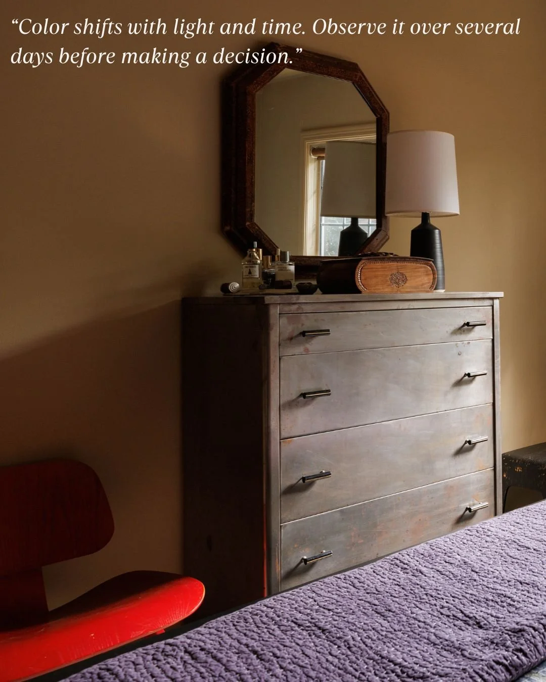
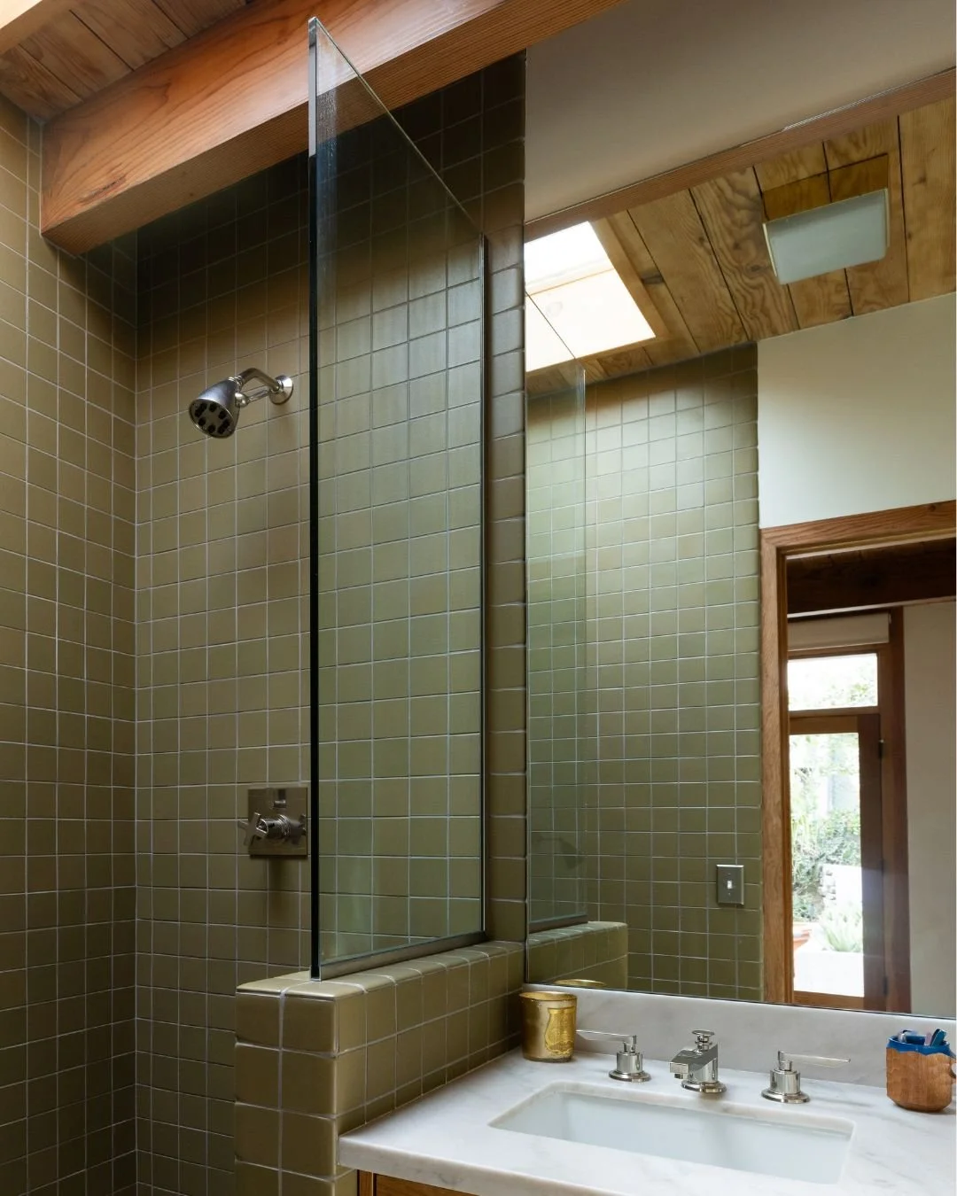
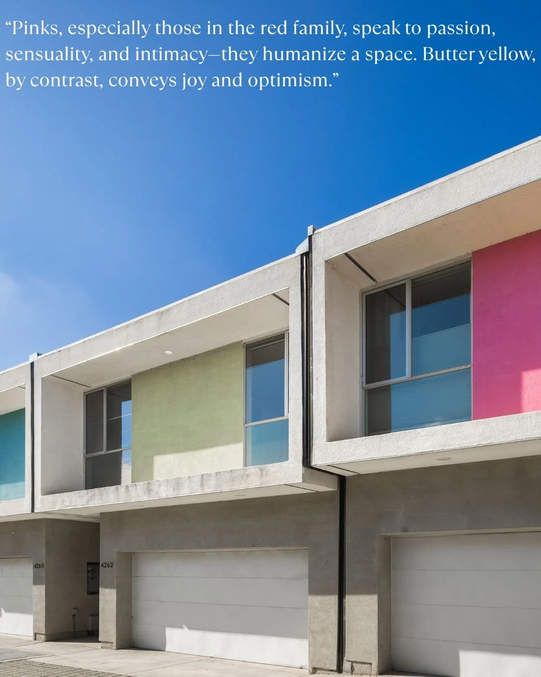
Nathalie - Color multiples in impact as it scales. What seems soft on a swatch can feel intense when it covers an entire room, especially in color-drenching where walls, trim, and even ceilings share the same or harmonized hues. Context is everything.

Begin by observing your space. How much natural light does it get? North-facing rooms cool colors, while south-facing rooms warm them. Artificial lighting also shifts perception depending on whether it leans warm, cool, or neutral.

If a color you love feels too bold, do not discard it, refine it.

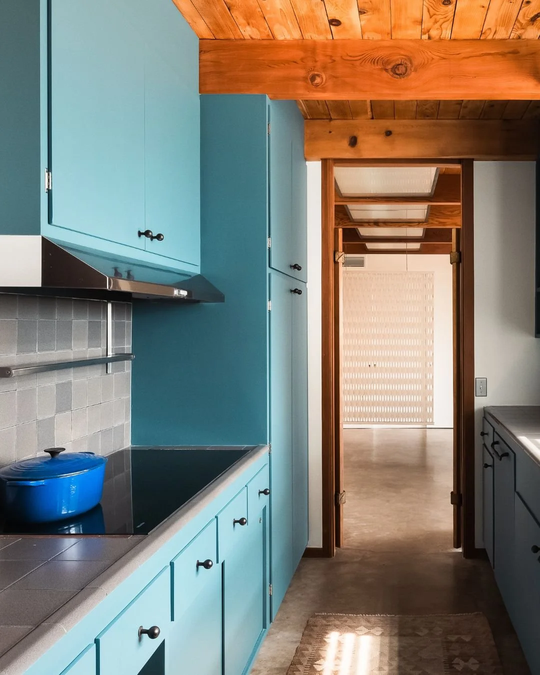
Aiesha - You’re originally from New York and have lived in France and London. How does light and architecture affect color choices in Los Angeles compared to those places?

Nathalie - Geography plays a major role in how we experience color, and light quality is one of the most critical factors I consider when building a palette.

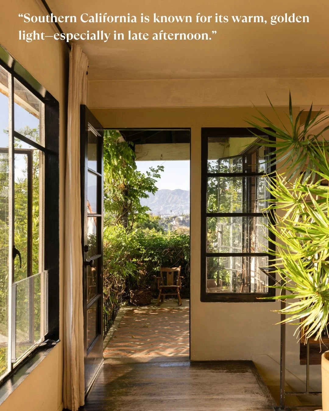
Southern California is known for its warm, golden light - especially in late afternoon. That kind of sunlight can make colors appear more saturated, sometimes even exaggerated. So, when I use bold hues here, the concern isn’t that they’ll feel flat - it’s that they might overwhelm or cause “color bounce,” where walls reflect more color into the space than expected.

In contrast, cities like New York, Paris, or London tend to have cooler, diffused light due to weather and seasonal grayness. In those environments, colors read more subdued, even moody. Richer tones feel cozy rather than loud. The concern there is usually about making sure a space doesn’t feel too dim or cold.

What feels romantic in a London flat might feel garish in a California bungalow, simply because of the surrounding light and architecture. The same red may feel warm and elegant in one setting - and jarring in another.

Aiesha - For someone just beginning a renovation or new build, what’s a smart first step when it comes to color?

Nathalie - Start with a feeling. Ask: How do I want this space to make me feel? Calm and serene? Bright and energized? Cozy and nostalgic? Once you have that, start collecting references - photos, textiles film stills. I often suggest clients think about movie interiors they love. Take Nancy Meyers’ films- those spaces feel effortlessly homey, with soft tones and natural light. They tell a story of comfort.

In set design, we’ve built entire worlds around emotional tone. When I worked on Interview with the Vampire, the palette was all deep merlots, crimsons and rusts - colors that supported the story. It’s no different with homes. Color sets the emotional tone. Used with intention, it creates atmosphere and cohesion. That’s what I help clients discover.